Profile Presentation: Tips and Tricks
Your profile page can say quite a bit about what kind of person you are, and having a well-designed profile page will help ensure that your visitors leave with a good impression of you and your work. And if you do a remarkably fabulous job at designing your profile, people will not only be impressed, but they will also keep coming back to take another look. In this article, I will go over some useful tips and tricks for making your profile look professional but also personalized!
This article is mostly directed towards Premium Members, but non-Premium members can still use some of these concepts to personalize their page.
Basic Design Concepts
Before we get started, I first want to go over some basic concepts you should keep in mind when you are designing your profile:
1. Text
If you want people to read the text that is on your profile (whether it's a short About Me section or important information about your commissions), make your text easy to read. Always make sure that there is enough contrast between the background and the text. If you are using a dark background, make sure to either use a light text color or a light-colored Content Holder. (See CypherVisor's Colored Text codes).
Also check to see if your font is too small to read. Usually using one <small> code is alright, but adding more than one makes your font quite difficult to read.
2. Browsers/Monitors
While your profile may look absolutely fabulous to you on your browser, there's always a chance it may not look so great on others. In general, most of the text and content holders look the same on the different browsers. The main thing to care about here is that Custom Box backgrounds now look significantly different on Firefox and Chrome. On Firefox, the background retains its original size, and any overflow is hidden. On Chrome, however, the background size matches itself to the size of your Custom Box Widget.
People also have a variety of monitor widths, which can greatly affect the look of your profile to other people. To ensure that your profile looks fine to all of your visitors, I suggest using wide Custom Box backgrounds (at least 800px across).
3. Content
Finally, try to keep your profile to a reasonable length. You may have an epic computer that can handle the hundreds of thumbs and gifs that you have on your profile, but many of your visitors will not. If your page does not load on people's computers (or worse, if your page crashes their internet), they will not feel particularly inclined to look at your gallery, check out your commissions, drop a comment, etc.
One way to condense the size of your page is to use scroll boxes on your Widgets (see my tutorial for Scrolling Custom Box Widgets), but you should also think about whether you may just have too many things on your profile. ")
tl;dr What may look pretty to you may not always look pretty for your visitors! Make sure to think about how others may see your page.
Useful Codes
Custom Box Backgrounds
<div class="popup2-moremenu"><div class="floaty-boat"><br><img src="IMAGE URL HERE"></div></div><div class="gr-box gr-genericbox"><br>TEXT HERE</div>
Adding Images
<img src="IMAGE URL HERE">
<a href="URL"><img src="IMAGE URL HERE"></a>
<div class="al">Floating something on the left</div>
<div class="ar">Floating something on the right</div>
Creating a Unified Theme
One of the marks of well-designed profiles are a unified or matching theme throughout the page. Premium Members can achieve this through using matching Custom Box Backgrounds, Content Holders, Journals, and Image Decorations.
1. Add Custom Backgrounds
By far the most useful tool for profile customization, Custom Box backgrounds can create a completely new look for your profile. It is unfortunately limited by the fact that it can only be applied to Custom Box Widgets, but with a little bit of extra work and some cleverness, you can transform the drab, default green of your regular widgets into something new!
Before
Say that I wanted to feature a few of my favorite tutorials and also have an About Me section in the Deviant ID widget. Unfortunately, my background is the default dA green, which ruins the pink theme of the rest of my profile.

After
I added this Pink Hearts Custom Box Background to my widgets to present the same content, but in a way that matched the rest of my page. In this example, I used the same widgets (the Favorites Widget and the Deviant ID Widget) so that they stayed at the top of my page, but Custom Box Widgets work perfectly for this as well.

For Custom Box backgrounds, browse through:
Backgrounds at DazzlingDecorations
Custom Box Backgrounds at CustomizeYourProfile
2. Match Content Holders
Using matching Content Holders throughout your profile typically makes it look neater and more cohesive. Here are just a few of the many Content Holders that you can use. To find more, browse through the Custom Box Resources folder at CustomizeYourProfile


3. Match Journals
If you like displaying your journals on your profile page, then it's probably a good idea to match the design of your widgets with the design of your journal. Journals also offer a much wider variety of designing than regular widgets, and if you know some CSS, you can code awesome designs and hover effects to make your page look fancy!
4. Use Images Decorations
Header Images
While you can use a few different font faces and sizes on deviantART (see LabLayers' dA Font Formatting Guide or Gasara's Basic HTML Formatting Guide), you can create a more personalized look on your profile by using your own header images. With custom header images, you can use any font in any color, shape, or size! Here are some free-to-use examples, but you can always create your own as well:

All you need is an art program that allows for transparencies and text. Save your image as a .png or .gif and upload to your Sta.sh, scraps, or any other image hosting site. Then use the IMG SRC code to add your header images to your widgets.
Divider Images
Repeated use of the same divider images can help create a more unified theme for your profile. Here are some examples of free-to-use dividers. To find more, browse through the Dividers folder at DazzlingDecorations.


Artwork and Profile Navigation
This is where things start getting a little more complex. You've created a nice, unified theme with your profile. Now what?
Well, if you want to take your profile to the next step of awesomeness, you could work with Artwork Directories and CSS Directories. Instead of working with regular old thumbs, buttons, or links, try your hand at something unique!
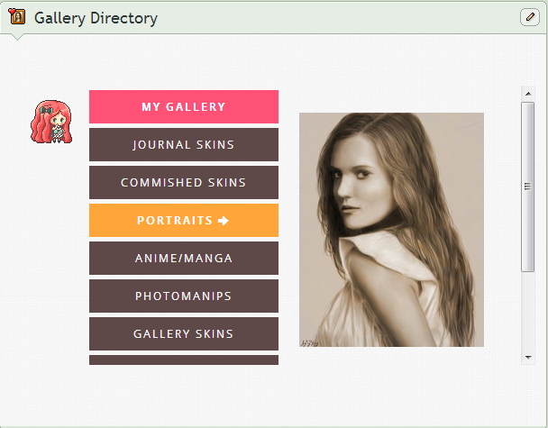
Artwork Directories
Creating your own menus and directory widgets for displaying your artwork is a wonderful way to not only show off your artwork but also give your page a highly unique and personalized look. While the Featured Deviation Widget or the Newest Deviation Widget can also display your work, making your own directories gives you a lot more freedom with your display.
Here are some examples of wonderfully designed artwork directories. Notice how these sort of displays are significantly more appealing than the regular Deviation Widgets.


 (left) and
  (right)

 (left) and
  (right)

The above examples used Content Holders and Custom Box Backgrounds as part of their designs, but non-Premium members can create Artwork Directories (or links to Social Media sites) as well by using only images. Notice once again how these are much more interesting
 (left) and
  (right)

CSS Widget Directories
For those who have some experience with coding CSS, CypherVisor's hack for adding CSS to profile widgets can prove to be enormously useful for making your profile uber fancy. Here are just some examples of what you can do:

See the live version on his profile!


See the live version on my profile!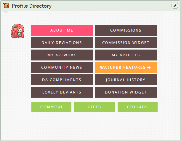

New! Here's a resource and a tutorial for those who would like to create their own Profile Directories:
Learn how to display journals in a Featured Deviation Widget. You'll have to learn how to code a journal on your own, but if you have do some experience with CSS, then I highly suggest trying this out!
Learn how to create a profile directory that links to the widgets on your page. This is very useful for those who have long profiles with a lot of different content because it allows viewers to find exactly what they are looking for without having to scroll through your entire page.
Some free, installable codes for creating one or two columns of buttons.
Examples of Fabulous Designs
Here are some of examples of well designed profiles that I managed to find. All of these use several of the design tips for a unified theme listed above, and they are also clean, simple, and easy to read.
*These screenshots are actually rather old, so the current profiles of the following deviants may look different from the images here.
 Kawiku uses a very unique, pixelated background that goes wonderfully with the image on the left side. She also consistently uses the green-outlined content holders to give her page a unified look, and the leaf divider as well as the custom header images make her page pop and appear more interesting.
 Arichy uses a personalized custom background with a fancy image of her username. The repeated snowflake decorations and the white custom box give her profile a very unified look, even with the deviantID image on the right whose color scheme does not match the rest of the page. The use of the blue cursive header images also add a touch of fanciness to the page.
 Kezzi-Rose takes a very interesting approach to her custom box backgrounds, using different variations of the same two shades of pink. This makes her profile look more dynamic while still maintaining a very cohesive theme. In addition, she uses matching custom boxes, buttons, and header images, and also includes several well-displayed samples of her own artwork.
 scatteredsnow does a very nice job of matching her widgets (on the left) to her journal (on the right). By using the same background for both, she ensures that her whole profile matches. The use of her own images add a touch of personality, and the repeated use of decorative borders helps make her profile consistent and matching.
 Gasara does a fantastic job with matching her entire profile page to one color scheme. Note how she uses the Featured Deviation Widget on the left side to format her links and text using CSS. Overall, her page is not only interesting, but also very clean and easy to read.
 Rosuuri creates a very unique look to her page through the clever organization of her own images. She uses a bright and bold color scheme that is attention-grabbing and refreshing, and the overall presentation of her page is very clean, sleek, and professional.
As you can see, it does take quite a bit of time, dedication, and creativity to pull off a page as remarkable and unique as the ones featured here, but it can certainly be well worth your time if it keeps visitors coming back to see more!
More Resources
Here are some great groups to browse through for profile-decoration resources:


Related Articles and Tutorials