ShopDreamUp AI ArtDreamUp
Deviation Actions
Buy Premium Download
588 Favourites
364 Sold
1 attached file
Clean Gallery V3.zip
1.29 KB


![Profile Greeting v2 [BROKEN]](https://images-wixmp-ed30a86b8c4ca887773594c2.wixmp.com/f/02493467-545a-4ee5-950e-4f7a5526d9c2/d7xy8te-5ba3be34-8e6b-4349-ab87-179b5b0fe521.png/v1/crop/w_92,h_92,x_0,y_1,scl_0.13086770981508,q_70,strp/profile_greeting_v2__broken__by_simplysilent_d7xy8te-92s.jpg?token=eyJ0eXAiOiJKV1QiLCJhbGciOiJIUzI1NiJ9.eyJzdWIiOiJ1cm46YXBwOjdlMGQxODg5ODIyNjQzNzNhNWYwZDQxNWVhMGQyNmUwIiwiaXNzIjoidXJuOmFwcDo3ZTBkMTg4OTgyMjY0MzczYTVmMGQ0MTVlYTBkMjZlMCIsIm9iaiI6W1t7ImhlaWdodCI6Ijw9NzIyIiwicGF0aCI6IlwvZlwvMDI0OTM0NjctNTQ1YS00ZWU1LTk1MGUtNGY3YTU1MjZkOWMyXC9kN3h5OHRlLTViYTNiZTM0LThlNmItNDM0OS1hYjg3LTE3OWI1YjBmZTUyMS5wbmciLCJ3aWR0aCI6Ijw9NzAzIn1dXSwiYXVkIjpbInVybjpzZXJ2aWNlOmltYWdlLm9wZXJhdGlvbnMiXX0.c20kStELpd6kE7Xk9T6A9mvbHLZVBDx5LaJzfCcgg20)

Suggested Deviants


Suggested Collections


You Might Like…


![[F2U] - Gray Forest ~ Core Ver](https://images-wixmp-ed30a86b8c4ca887773594c2.wixmp.com/f/326716e1-d7ed-4fa2-b1af-e2dc4f7f5944/dcbli3k-29f72a5c-e112-4245-836c-b8059b8c34d4.png/v1/crop/w_184,h_184,x_3,y_0,scl_0.25520110957004,q_70,strp/_f2u_____gray_forest___core_ver_by_legaki_dcbli3k-92s-2x.jpg?token=eyJ0eXAiOiJKV1QiLCJhbGciOiJIUzI1NiJ9.eyJzdWIiOiJ1cm46YXBwOjdlMGQxODg5ODIyNjQzNzNhNWYwZDQxNWVhMGQyNmUwIiwiaXNzIjoidXJuOmFwcDo3ZTBkMTg4OTgyMjY0MzczYTVmMGQ0MTVlYTBkMjZlMCIsIm9iaiI6W1t7ImhlaWdodCI6Ijw9NzIxIiwicGF0aCI6IlwvZlwvMzI2NzE2ZTEtZDdlZC00ZmEyLWIxYWYtZTJkYzRmN2Y1OTQ0XC9kY2JsaTNrLTI5ZjcyYTVjLWUxMTItNDI0NS04MzZjLWI4MDU5YjhjMzRkNC5wbmciLCJ3aWR0aCI6Ijw9Nzc1In1dXSwiYXVkIjpbInVybjpzZXJ2aWNlOmltYWdlLm9wZXJhdGlvbnMiXX0.Ikp3lnAVqNf8UOYkjPAYaAz6C8CXPCIgMETSdp0WrEk)
![[F2U] - Gray Forest ~ Core Ver](https://images-wixmp-ed30a86b8c4ca887773594c2.wixmp.com/f/326716e1-d7ed-4fa2-b1af-e2dc4f7f5944/dcbli3k-29f72a5c-e112-4245-836c-b8059b8c34d4.png/v1/crop/w_92,h_92,x_2,y_0,scl_0.12760055478502,q_70,strp/_f2u_____gray_forest___core_ver_by_legaki_dcbli3k-92s.jpg?token=eyJ0eXAiOiJKV1QiLCJhbGciOiJIUzI1NiJ9.eyJzdWIiOiJ1cm46YXBwOjdlMGQxODg5ODIyNjQzNzNhNWYwZDQxNWVhMGQyNmUwIiwiaXNzIjoidXJuOmFwcDo3ZTBkMTg4OTgyMjY0MzczYTVmMGQ0MTVlYTBkMjZlMCIsIm9iaiI6W1t7ImhlaWdodCI6Ijw9NzIxIiwicGF0aCI6IlwvZlwvMzI2NzE2ZTEtZDdlZC00ZmEyLWIxYWYtZTJkYzRmN2Y1OTQ0XC9kY2JsaTNrLTI5ZjcyYTVjLWUxMTItNDI0NS04MzZjLWI4MDU5YjhjMzRkNC5wbmciLCJ3aWR0aCI6Ijw9Nzc1In1dXSwiYXVkIjpbInVybjpzZXJ2aWNlOmltYWdlLm9wZXJhdGlvbnMiXX0.Ikp3lnAVqNf8UOYkjPAYaAz6C8CXPCIgMETSdp0WrEk)


Featured in Groups


Description
how to use:
In order to use this gallery skin, please purchase the download using the widget on the right.
Premium membership is required!
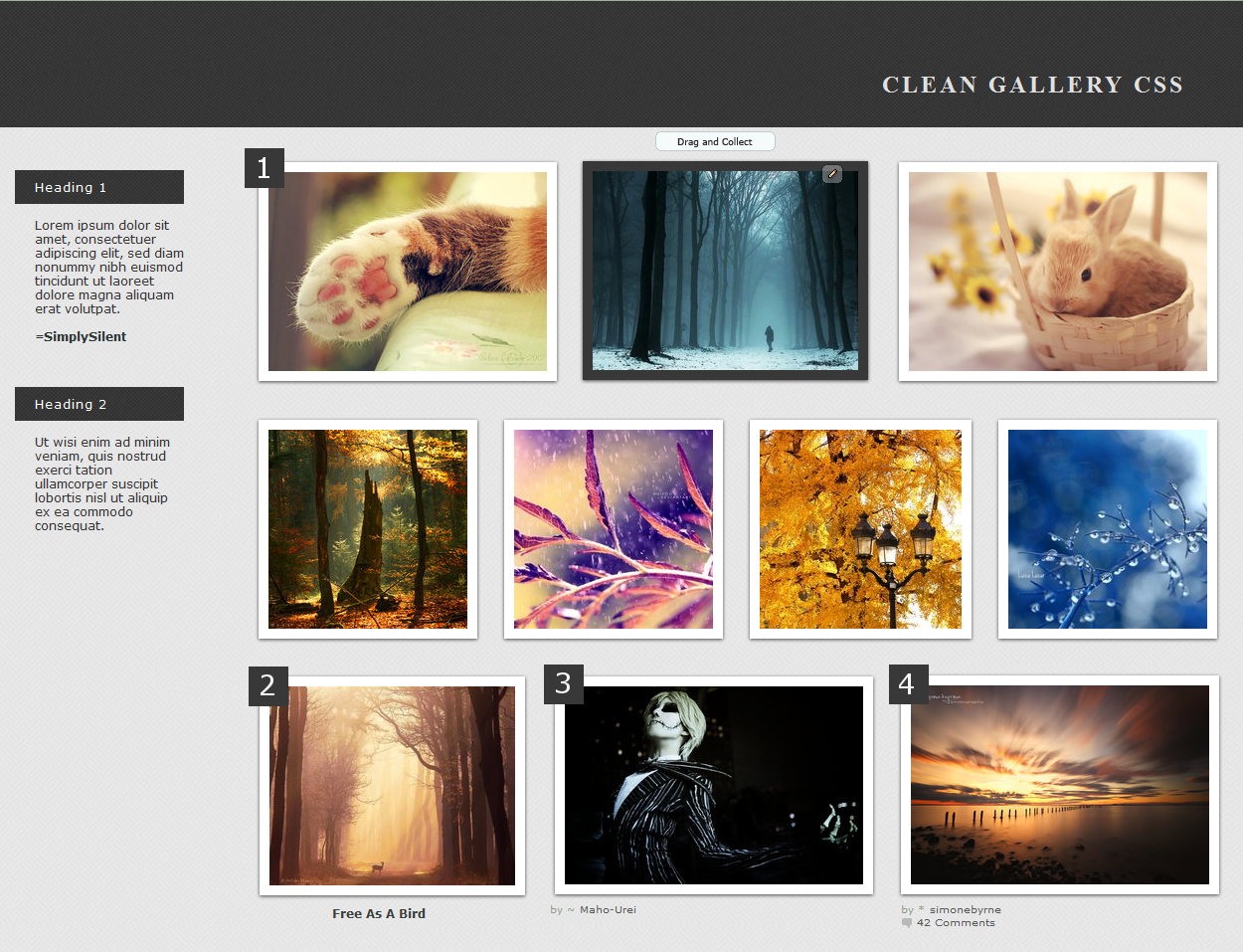
Live Preview Here
download includes:
- Gallery CSS
- Instructions for adding to folders and for using the six customizable options (overview below)
features:
- Description Headings:
<div class="heading">Heading Here</div>- Hidden print icons, feed buttons, and More Like This
- Six easily customizable options for images:
1. Nothing: Default setting
2. Title only: Delete 1st line in code
3. Artist only: Delete 2nd line in code
4. Artist and Comments: Delete 2nd and 3rd lines in code
5. Title and Artist: Delete 1st and 2nd line in code
6. Display all: Delete the first 3 lines in code
updates:
- Version 4.0: Newest fixes after dA's update (Jan 7, 2014)
- Version 3.0: Fixed header after dA's update (August 30, 2013)
- Version 2.2: Artwork details centered (July 15, 2013)
- Version 2.0: Shadows now work for Chrome; Fixed margins so thumbs are spaced out more (June 14, 2013)
- Version 1.0: Hidden "More Like This" links (April 27, 2013)
more skins

Image size
1250x957px 1.03 MB
© 2013 - 2024 SimplySilent
Comments210
Join the community to add your comment. Already a deviant? Log In
Amazing simple clean gallery page you have there! <img src="e.deviantart.net/emoticons/s/s…" width="15" height="15" alt="
What I love:
-I have to say, both the background and the header, with crisscrossing truly adds contrasts.
-The fonts. Not much to say about that - they are simply readable and are right fit for the layout.
-The boarders. Not much to say about that either, I just loved how clean it looks like an actual gallery.
What I'd like to see:
-The heading fonts, where it says "Header 1 & 2". Instead of regular fonts, I would really like it to stand out with a bold text. For me the regular text for the title doesn't catch my eye enough.
-The title. My suggestion for the title is to make them look bigger so they stand out well. Make it shout, in order for the audience to continue reading. <img src="e.deviantart.net/emoticons/s/s…" width="15" height="15" alt="
Overall the layout is fantastic. It does remind me of an online portfolio by the way. <img src="e.deviantart.net/emoticons/b/b…" width="15" height="15" alt="